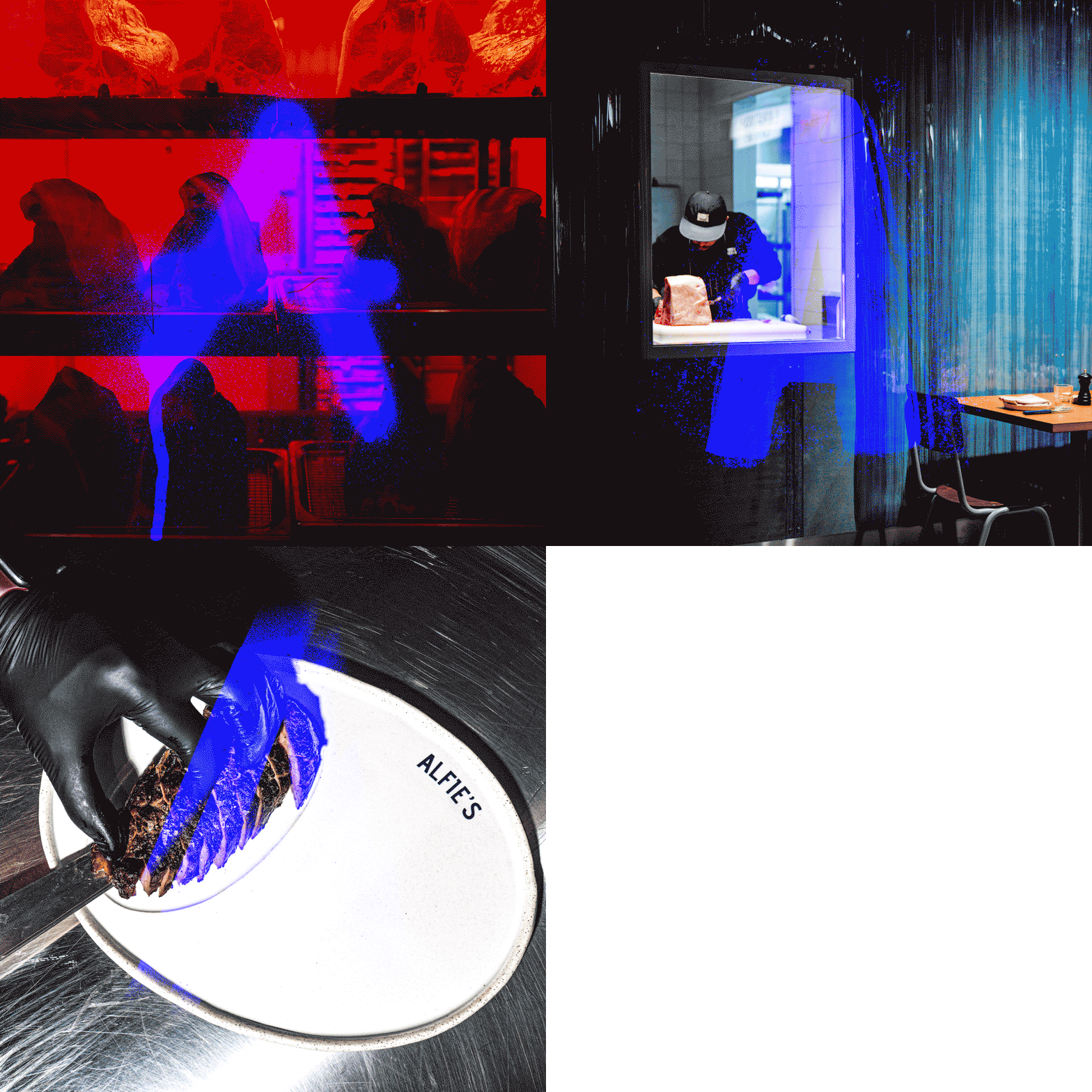


Alfie’s is your right-hand man — all action, no distraction. Guests move through the space with purpose: in, out, satisfied. The offering is intentionally singular: a perfectly cooked sirloin as the main event, flanked by a tight rotation of exceptional sides.
The experience is fast — just over an hour — with the dry-aged steaks prepared in plain sight, washed in the red glow of the ageing cabinet. The sounds are dapper, the art is bold, and the energy inside the venue is explosive.
To bring this attitude to life, we created a visual identity that breaks the rules with intent. Several key signage moments anchor the brand: a neon ‘A’ trapped within a stainless-steel cage, a zinc-anodised wordmark, and a deliberately lo-fi lavatory lightbox. Every touchpoint feels raw, immediate and unmistakably Alfie’s.
More than a restaurant, Alfie’s reinvents the steakhouse — stripping away the traditional excess and opulence in favour of grit, pace and personality. It’s a butcher-meets-bar with swagger, built to cut through the corporate norm.


Inside a projection video reel washes the wall of the dining space with an eclectic mash up of eye candy and pop culture. This moving artwork enlivens the space and injects the a bit of East London into the dining area.
I took on brand direction, asset rollout, signage design, internal projection reel and finished art.