Amanagara Sydney

Both literal and aspirational, the words 'city of peace' reflect their brand promise – convenient access to one of the busiest global cities and a private retreat from the rush of the CBD.
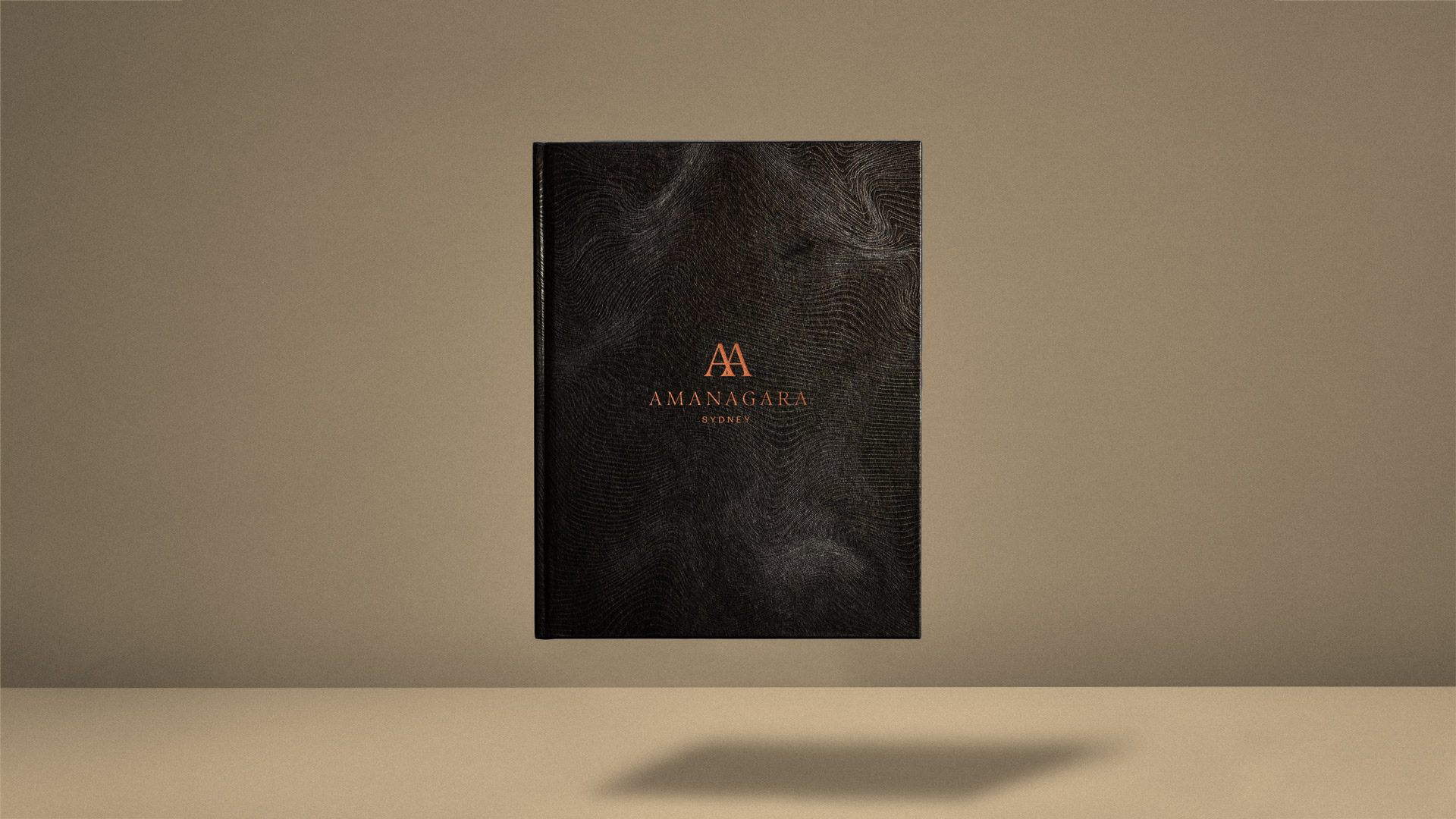
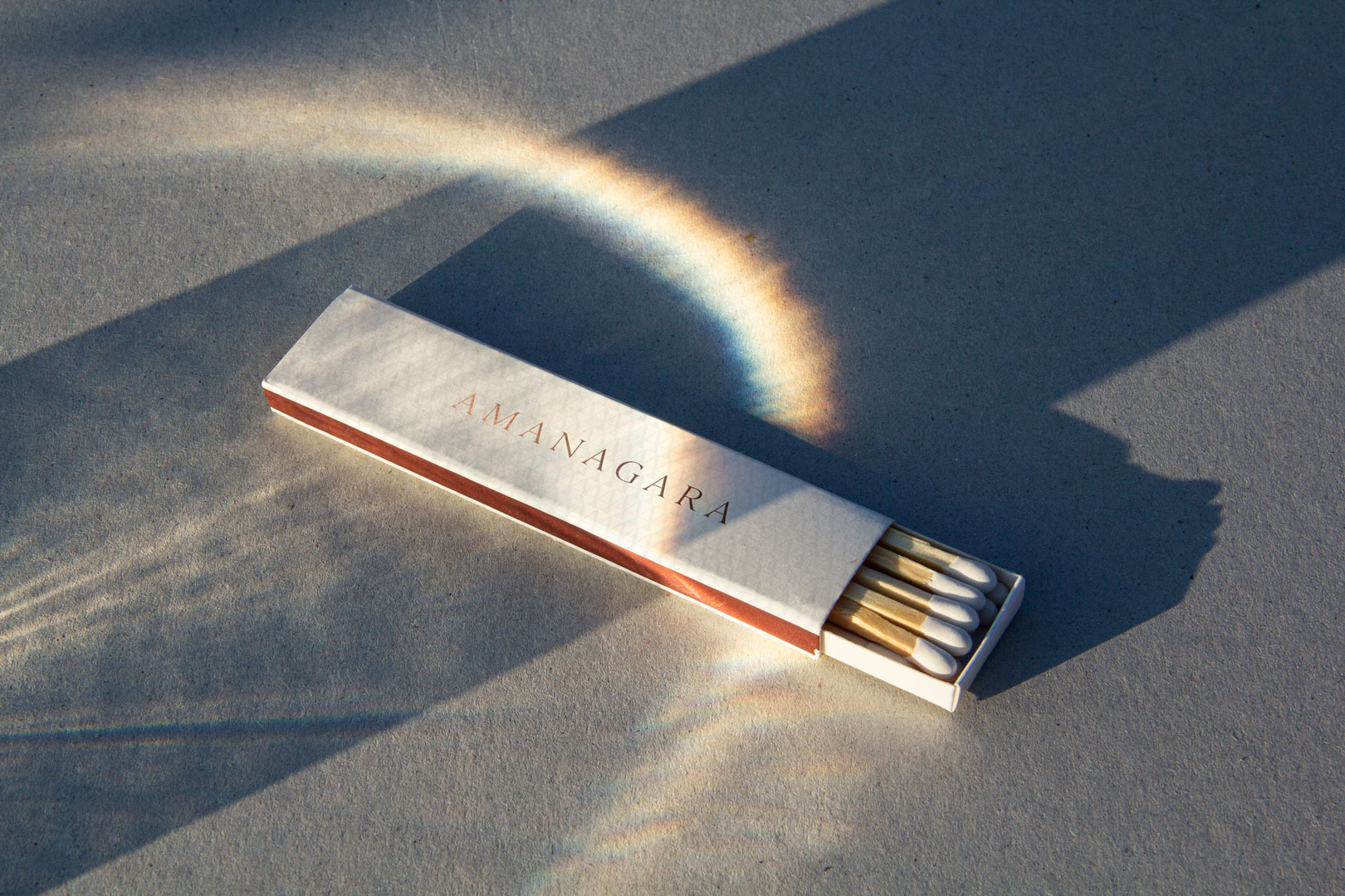
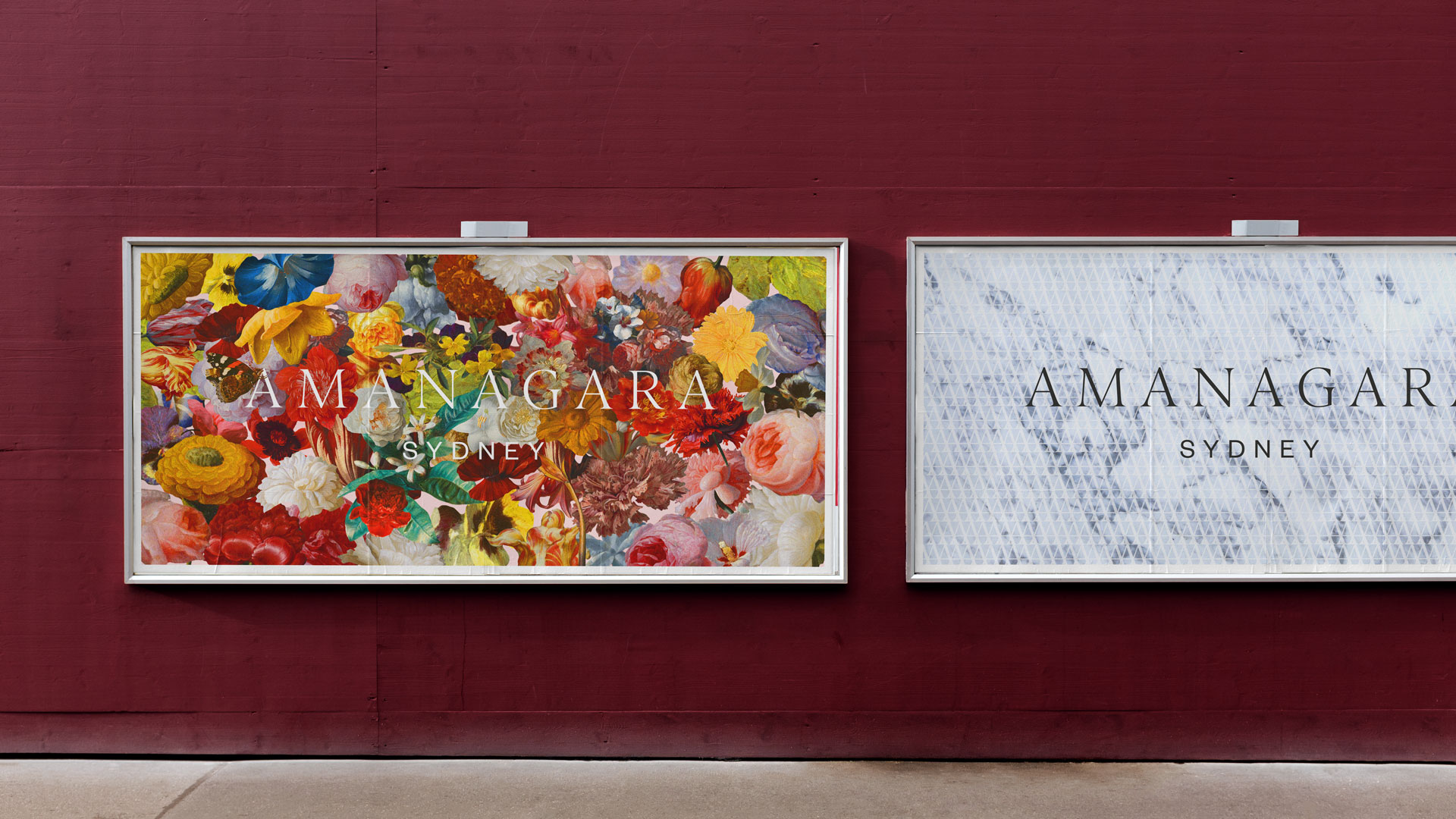
Collateral was designed with connection to the land in mind – hints of sandstone, land topography, and wild flora all collide on ultra-high end finishes across packaging, print and some digital concepts.
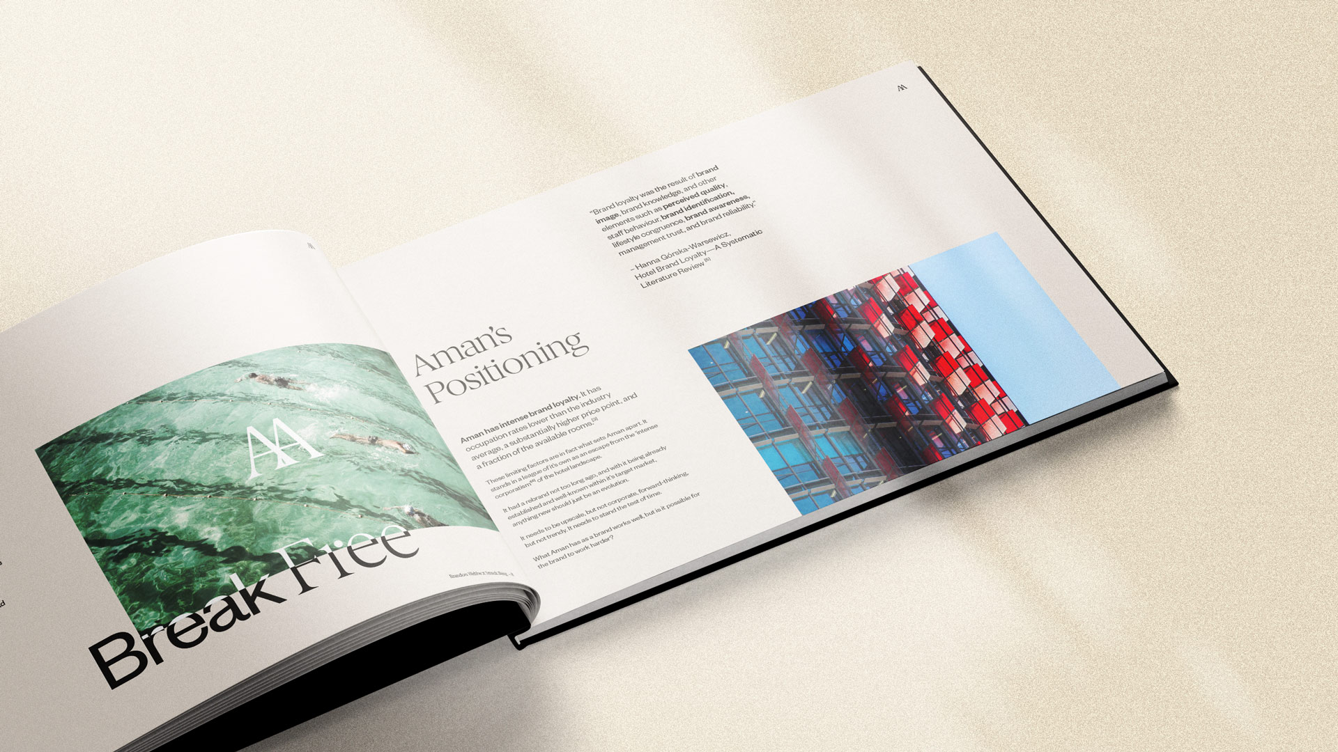
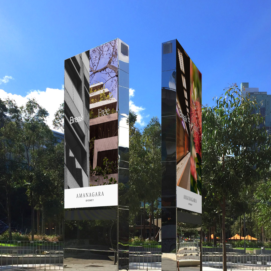
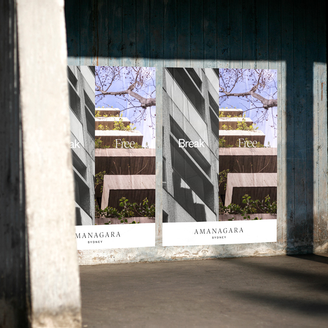
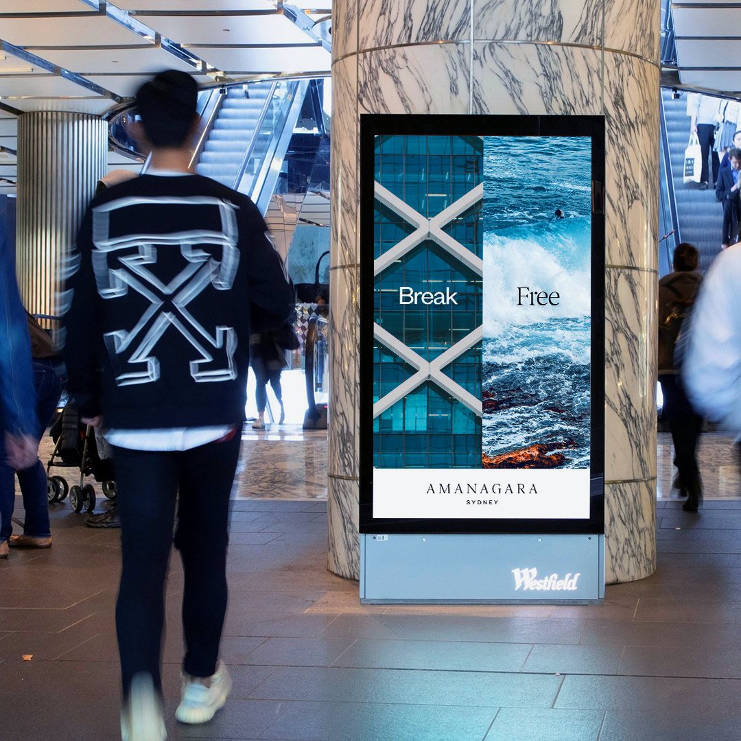
As another value-add for the client, I took the brief a step further and crafted a campaign around the concept of 'breaking free' – of the traffic, of the noise, of the crowds and entering the oasis in the city. Using photography as the primary device, juxtaposing the two sides of Sydney with two fonts, and offering Amanagara as the solution.
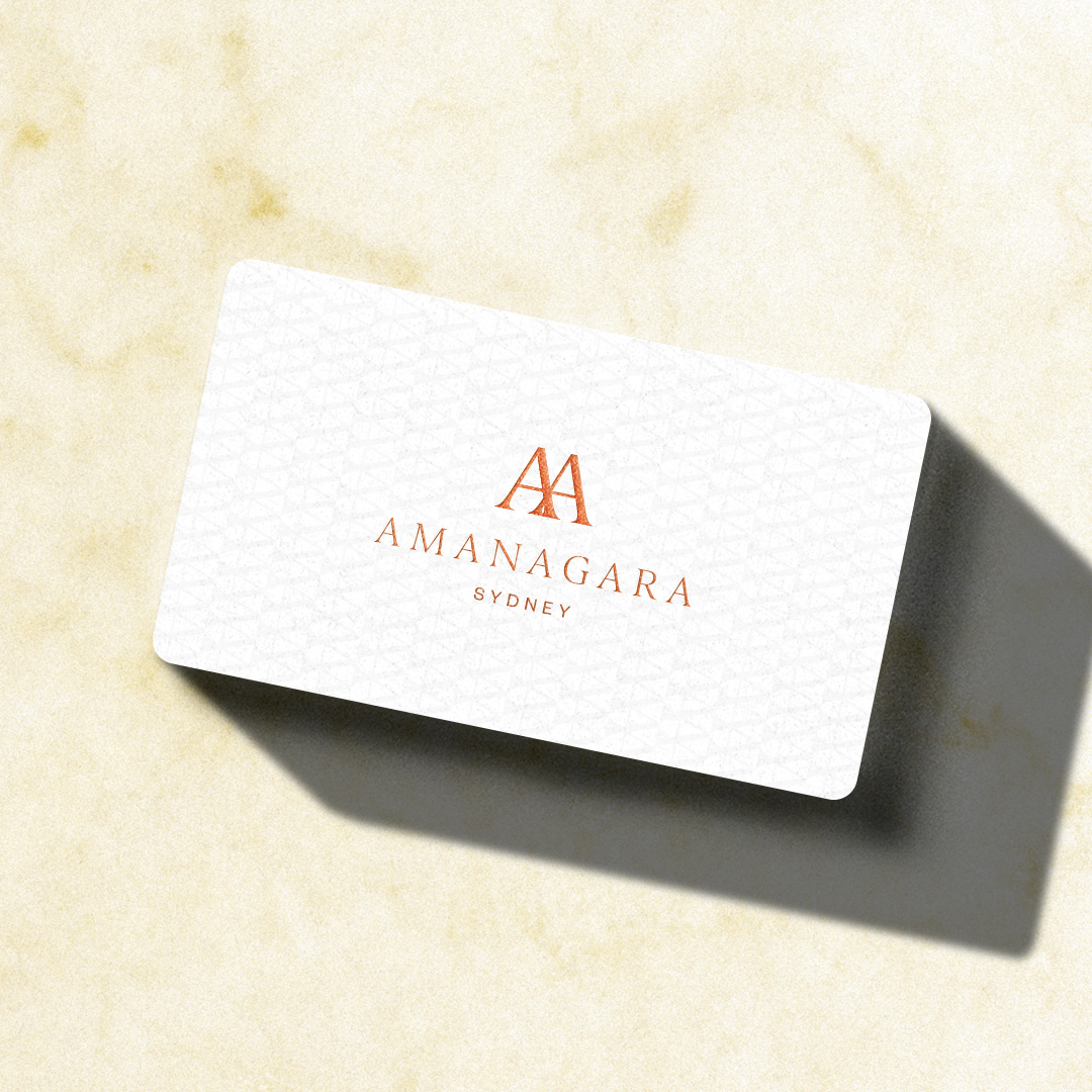
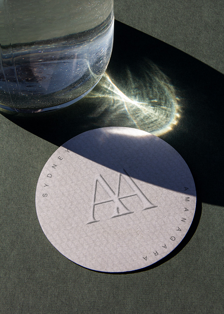
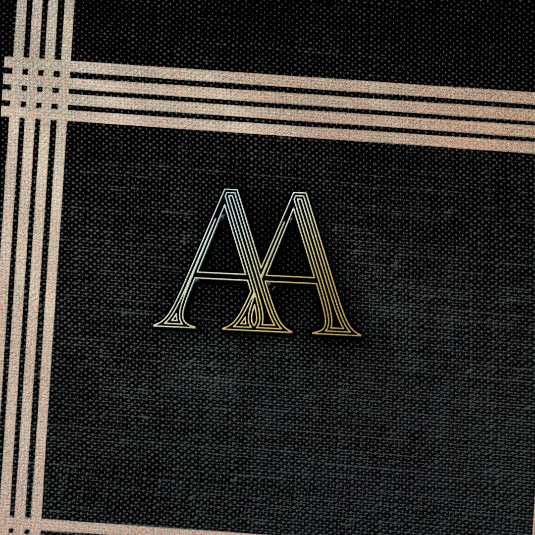
The brandmark monogram combines two 'A's to form an M, A and N – spelling Aman. An animated brandmark was an extension of this, designed to be used in digital placements.
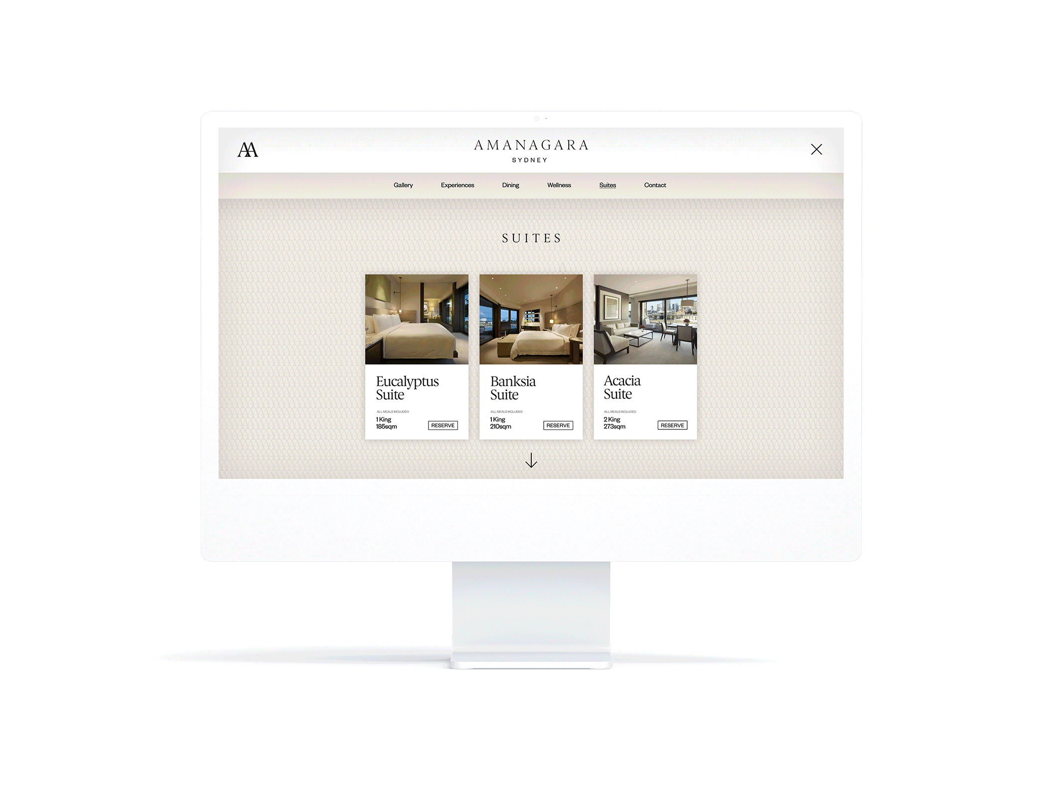
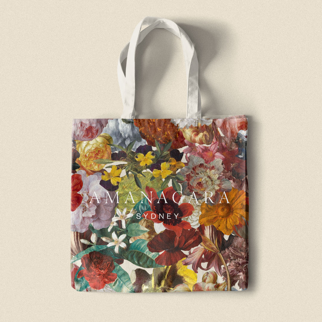
Tessellating patterns of the 'A' are used on many of the hotel's collateral as another subtle touchpoint, while the vintage floral collage is a much louder execution that ties the brand back to the land.