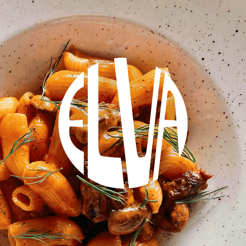
Taking cues from some of the more expressive inner-city eateries, we steered Elva toward a fresher, bolder identity—one rarely seen in Bondi. Rooted in the charm of traditional trattorias, the new wordmark references historic shopfront signage, while the colour palette draws from the greens and oranges of vintage motorsport and the sun-soaked Mediterranean.
Just like pizza dough, the Elva mark is designed to stretch, pull and reshape to suit any application. Its bespoke letterforms and palette ensure every variation remains cohesive yet full of character—even when rolled out, kneaded or pushed to its limits.
Brand exploration, concept, rollout and animation by Brandon Wehbe.
Strategy & creative direction by Rob Smith.


