Group-wide promotions at Merivale are exceptionally rare—this was the second occurrence. Brought in as a freelancer, my role was to inject fresh thinking into the campaign for the second consecutive year.
The project began with a high-concept ideation sprint. This idea started from a simple notion—blocking out 20% of our imagery and forcing the typography into a compressed space—evolved into something more iconic: an exclamation mark. A bold, expressive symbol that underscored the rarity of the offer. It felt scroll-stopping—almost like a digital error or alert. A visual cue that made it unmistakably not business as usual.
It also served as a subtle callback to the previous year’s campaign which shared a similarly digital-forward aesthetic.
The rollout spanned extensive digital placements, outdoor media, Truskins and Instagram takeovers across many of Merivale’s leading venues. From concept development to motion design to final artwork delivery, I oversaw the campaign end-to-end.


As part of the conceptual exploration, I also developed a series of unused animation tests centred on the idea of “picturing the possibilities.”
This direction celebrated the breadth of the Merivale portfolio through hyper-stylised, arresting visuals—flipping traditional food photography on its head. By censoring the hero element of each dish or drink, we invited viewers to imagine what might lie behind the block. A playful exercise in curiosity, and another take on stopping Sydney mid-scroll.
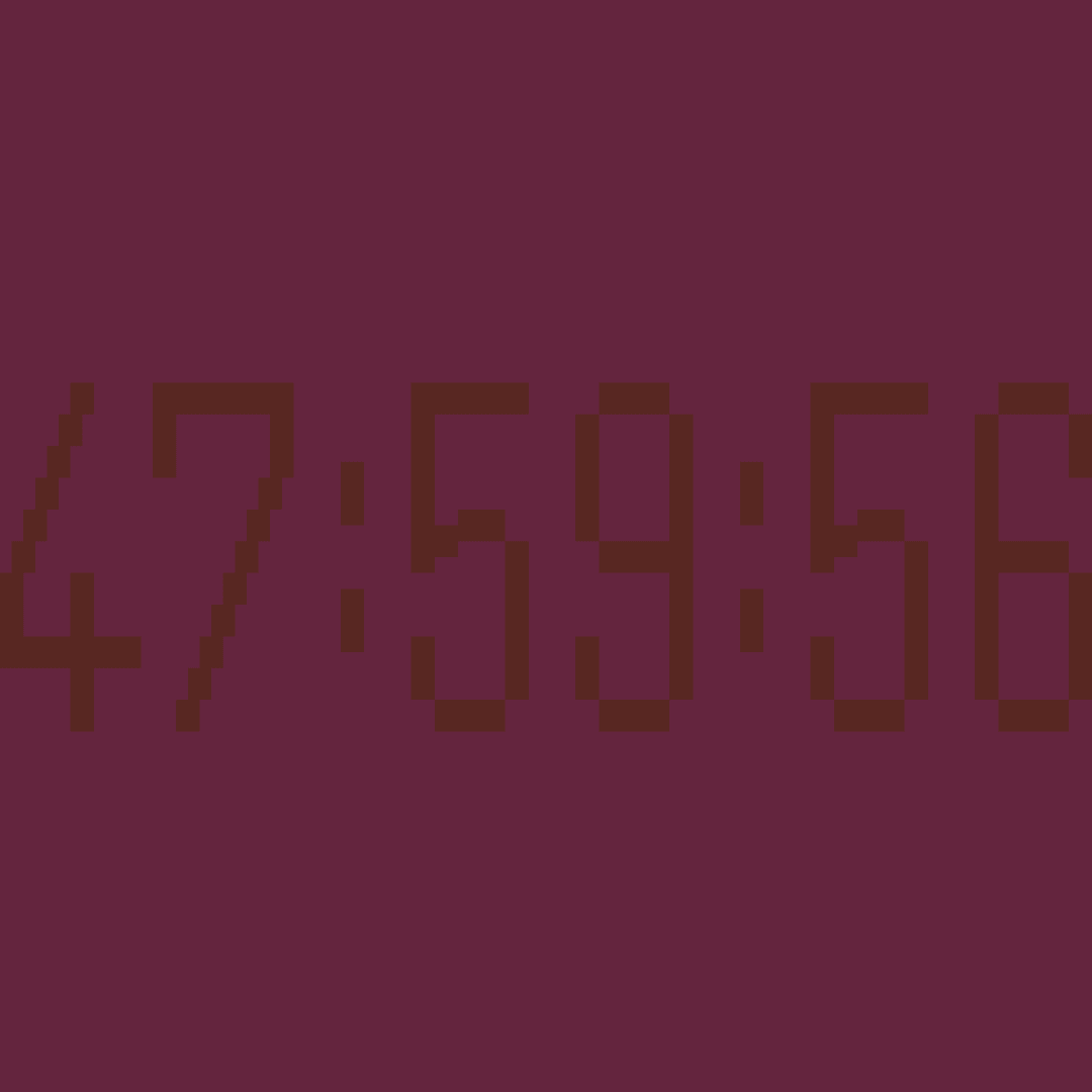
In a digital world filled with hackers, phishing attempts and too-good-to-be-true pop-ups, it’s easy to question what’s real. Leaning into that tension, “This is not an error” became the self-aware tagline driving a suite of eclectic, Y2K-inspired motion graphics.
20% off Merivale.
Yes, it’s real. But only if you move fast.
The campaign was developed in a rapid one-week sprint—crafted to disrupt feeds, spark curiosity and capture Sydney’s attention in under 48 hours.
The first campaign established the tone—playful, digital, slightly disruptive.
The second took that spirit and pushed it further, creating a clearer, more distinctive visual language for a now-established annual moment.


